Blog
Building Cinematic Marketing Sites
How dark UI, motion hierarchy, and sharp CTAs turn a creative studio homepage into a lead engine.
- Author
- Quoreeb Adebayo
- Published
- July 14, 2026
- Read time
- 5 min
Article
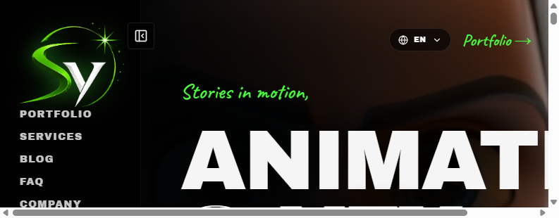
Creative brands need websites that feel like the work they ship. For studios doing animation and VFX, flat templates kill the pitch before the reel starts.
I approach cinematic marketing sites with three layers: atmosphere (color, type, imagery), navigation that stays out of the way, and conversion paths that stay visible — portfolio, services, and start-a-project.
Motion should guide attention, not distract. Hierarchy beats effects. The goal is simple: make the brand feel premium, then make it easy to hire.
That is the same thinking behind projects like Starlights Visuals.
Web DesignCreativeConversion
More posts

Jul 20, 2026 · 5 min
From Brief to Shipped Website
A compact delivery checklist I use from discovery to go-live on marketing and product sites.
ProcessClient WorkLaunch

Jul 18, 2026 · 6 min
Next.js on Vercel for Client Launches
Why I ship many client marketing sites with Next.js and Vercel for speed, SEO, and low ops overhead.
Next.jsVercel